Chapter Seven
Technical analysis
Technical analysis’ philosophy is based on four basic concepts:
1. The market value of a product or a service is determined by the interaction of supply and demand.
2. Supply and demand laws are governed by a host of rational and irrational factors in regards to customers.
3. The market is not always totally efficient and prices tend to correct themselves to a new equilibrium after the occurrence of new information. Discarding minor fluctuations, prices of individual stocks and of the overall market tend to move in trends which may persist for quite some time.
4. Examinations on prior price and volume data may determine past market trends and patterns, and may be used to predict the future.
Therefore, according to technical analysts fundamental analysis is a waste of time and resources. Knowing the nature of business of a company and its accounting statements will be of little help to predict its stock price. Instead, analyzing trends and patterns on a chart is more useful to predict price movements by extrapolating from historical price patterns. Technical analysts are therefore called also chartists.
Price and Volume
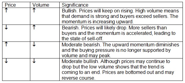
Four basic relationships between price and volume are highly considered in technical analysis:
Mass psychology
The technical analysis school believes that the human psychology never changes over time and reacts according to usual patterns. In general, many people think that the market is driven by greed and fear. Greedy investors keep on buying when the market is on a bullish mode and whenever struck by fear, they sell off irrationally. A negative rumor, although unconfirmed, may trigger a bearish sentiment and a chain reaction of selling activities. The opposite is true also, positive news can set off a buying pressure and more investors jump in the band-wagon. Somehow, people don’t want to be the last ones to join the momentum so they react first and think later. Nowadays, with the advance of telecommunications, notably the spread of the Internet, news travel fast and mass psychology plays a crucial role to the volatility of the stock market.
Nonetheless, a phenomenon called “buy on rumors, sell on news” exists and frequently, a stock price jumps up when rumors are spreading that a company has had good news but decreases markedly when the news is confirmed.
At any time, three categories of investors are present and influence the behavior of a stock: (1) investors who are long on the stock, (2) investors who are short on the stock, and (3) the ones who are undecided and on the sidelines.
Trends
In general, a stock price follows four stages or phases:
1. Accumulation phase. At this stage, the number of buyers and sellers are even. When more buyers jump in, the stock price moves upward. But when the number of sellers exceeds buyers, the stock price recedes. The chart demonstrates the following form:
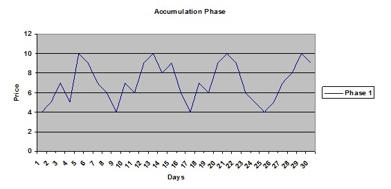
When the number of buyers exceeds sellers’, the stock price starts to rise. The ones who are long somewhat regret they should have buy more and the undecided feel sorry that they should have jump in sooner. Both categories constitute a buying pressure which makes the stock price keeps on rising. At a certain point, the buyers decide to cash out profits and start to sell. The number of sellers surpasses the number of buyers and the stock price begins to retreat. Noticing the trend, short sellers may increase the selling pressure.
However, when the stock price goes back to its initial level, provided nothing new happens regarding the company operations, buying pressure starts to materialize. The relative low price attracts buyers and a new cycle begins.
The repeated ups and downs cycles form two lines called the support line below and the resistance line above. The two horizontal lines are parallel with each other and outline the trading range of the stock in the accumulation phase. The observable fact will last until a significant event occurs and changes the movement of the stock price, either up or down. The event may be specific to the company or macroeconomic of the market in general. In the above example, the resistance line is at 10 and the support line is defined at 4.
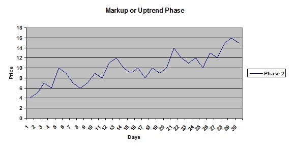
2. Markup or uptrend phase. No doubt that this stage brings satisfaction for most investors, except those who are short on the tock. The markup phase starts with a breakthrough of the stock price, pouncing the resistance line with high volume. The breakthrough usually follows good news about the company which may change radically its fundamentals.
After several days hovering above the resistance line, the trend is confirmed and the resistance line becomes a new support line because at any time the stock price goes back to this level, buyers will jump in and bid up the price. During the uptrend phase, the support level, as well resistance level, keeps on getting higher and the trading range between the two lines turns into an ascending range.
Investors can expect that when the stock price reaches the resistance line, chances are that it will go down and when the stock price touches the support line, it may go up.
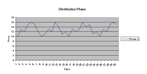
3. Distribution phase. Eventually when the stock price reaches a certain high level, it becomes less attractive and the buyers’ pool diminishes, some even turn into sellers to cash out profits. A new price ceiling or resistance line would be formed. On the other hand, the old resistance line may become new support line and any time the stock price goes down to that level, chances are that it will rebound. After many up and down cycles, a new trading range materializes which defined the distribution phase of the stock. In the example, the resistance line is set at 16 and the support line at 10.
4. Markdown or downtrend phase. After a while, new events may occur and break the distribution phase pattern, either up or down. In this case, events are negative and the stock price starts a downtrend phase which is somewhat the reverse of the uptrend phase examined above. The stock reaches a new low and lower high after each cycle and a down trading range is outline with downhill resistance and support lines.
Chart Patterns
The crucial issue for any chartist is to be able to identify a continuation or a reversal of the stock trend. In order to do that, they rely on certain patterns that have been proved to be fairly accurate in the past to signal a major change of the stock price trend. Many patterns exist and the scope of this book is limited to some of the most popular patterns in technical analysis.
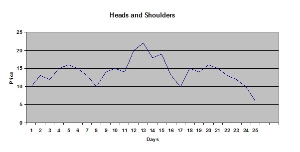
1. Head and shoulders. This is perhaps the most popular chart pattern that signals a reversal of a stock trend and because of its popularity, reinforces investors’ expectation that a reversal chart pattern is about to occur. The sentiment influences their behaviors and makes the change to happen. A head and shoulders pattern following an uptrend is an indication that the stock is entering either a distribution phase or a downtrend phase. To be reliable, the pattern should last in a matter of weeks, not days.
In the following figure, the pattern has a head and two shoulders, and a neckline (at 10). The first shoulder and head can be understood as the last cycle of the previous uptrend which is defined by rising highs and rising lows with time. After the formation of the head, the stock price loses its momentum and reaches a low which is at the same level as the previous low (instead of a higher low). When it bounces back, the stock price fails to reach a new high and touches only the level of the first shoulder, then decreases. The stock price enters a new trend, mostly a downtrend although this new trend could become a distribution phase. Usually, when the second shoulder has been formed, investors begin to watch out the stock and jump in when the stock price breaks the neckline, making the pattern more reliable.
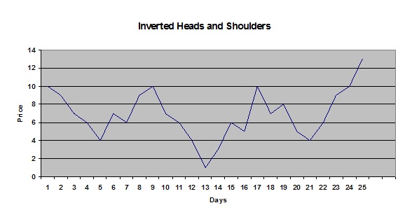
The exact opposite pattern is the inverted head and shoulders which signals an upward reversal trend. Following a downtrend, after the head formation which marks the lowest point, the stock price is able to break through the resistance line and touches the neckline before going down to the second shoulder point which is at the same level of the first shoulder, then bounces back. If the stock price is able to leap through the neckline, the inverted head and shoulders pattern is confirmed and the trend is likely becoming an uptrend in the days to come.
2. Double Tops (M pattern) and Double Bottoms (W pattern). This chart pattern is another popular indicator of a reversal after a sustained trend and signals to technical analysts that the trend is about to change. The pattern is formed when the stock price tests its support or resistance line twice with no success. Double Tops and Double Bottoms are known to be reliable for intermediate and long-term trends.
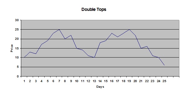
Double Tops pattern appears at the end of a rally when the stock price makes unsuccessfully two consecutive attempts to break through its highest levels (at 25 in this case). The rational of this pattern is that the longs are wary after a good rally and because no new positive developments occur to sustain the uptrend, the overall sentiment is to cash out some profits.
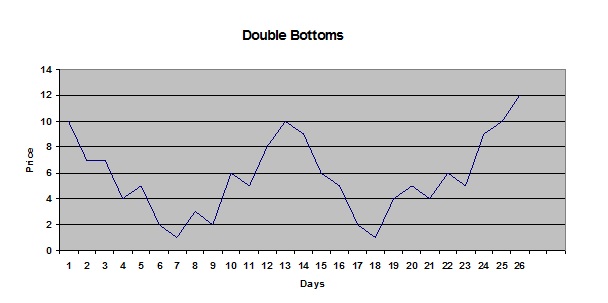
Double Bottoms pattern is the exact opposite of Double Tops and may become visible at the end of a bear market. The stock price meets its bottom twice and able to recover. Without any bad news, chances are that the Double Bottom pattern marks the end of the sell off.
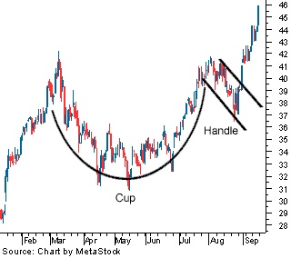
3. Cup and Handle pattern. This pattern is commonly viewed as a bullish continuation of an uptrend and the cup and handle’s form is a pause of the stock price to digest its gains. The pattern needs to last in a matter of weeks and months to be reliable. During the cup and handle period, “weak hand” investors (sellers) quit the stock and its price may resume its advance forward.
4. Triangles patterns. Triangles patterns are among the most used in technical analysis to predict a stock movement after a sharp move, either bullish or bearish. The stock is known to be in a stage of “consolidation” before making a new breakthrough. Three types of triangles patterns exist and can predict a neutral significance (symmetrical triangle), a bullish significance (ascending triangle), or a bearish significance (descending triangle).
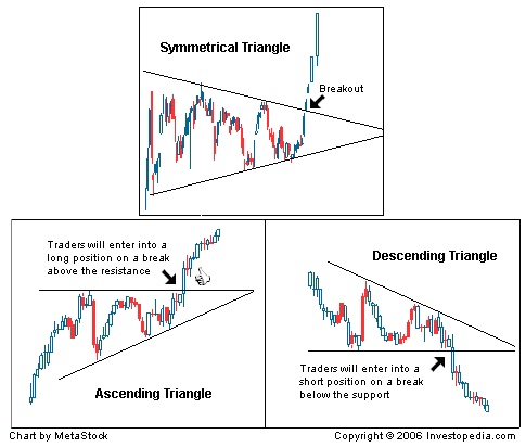
On the symmetrical triangle, the two trend lines converge toward each other and the breakout at the end of the triangle may determine the course of action of the stock. The stock may do down or up.
In the ascending triangle case, the upper trend line is somewhat horizontal while the bottom trend line slops upward to meet the upper trend line. The pattern is viewed as bullish and chartists look for an upside breakout above the resistance line.
On the other hand, the descending triangle pattern has a flat support line and the upper trend line is descending to meet the bottom trend line. The pattern is thought as bearish and a breakout to the downside will happen at the end of the descending triangle.
Chart Styles
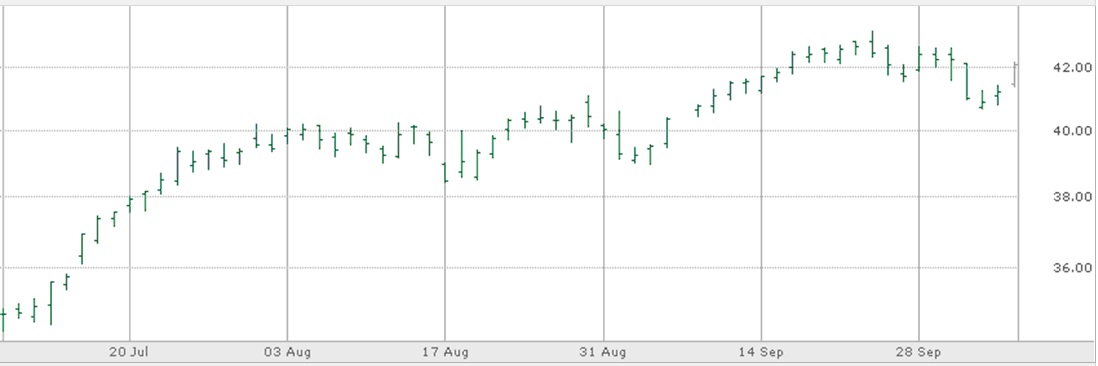
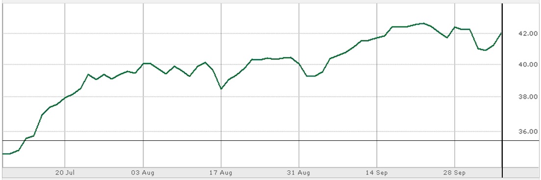
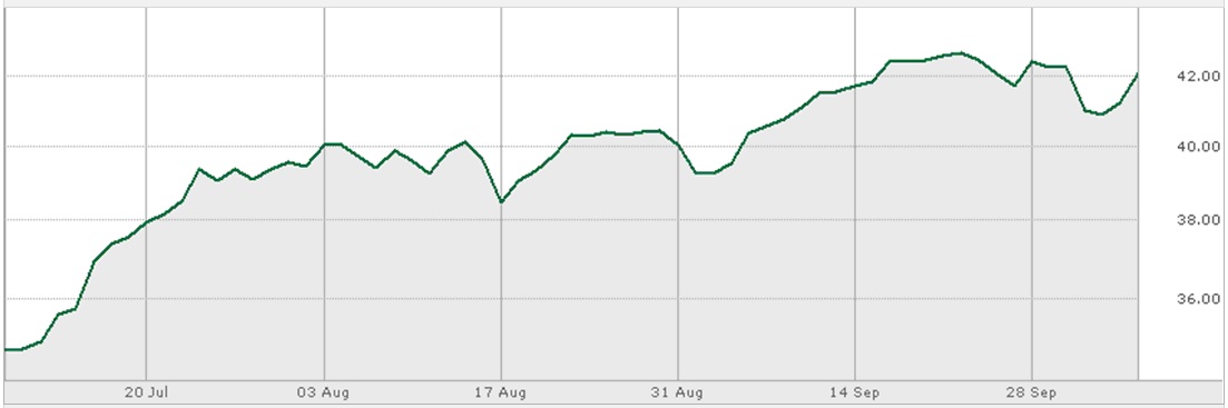
The most commonly used chart styles are (1) OHLC, (2) Line Chart, (3) Mountain, (4) Dot chart, and (5) Candle chart. Because Candle chart is by itself a very interesting subject, its details will be described in the next chapter.
1. OHLC chart. The chart has four indicators which are the Open (small notch at left side of the bar), the High (highest point), the Low (lowest point), and the Close (small notch at right side of the bar).
2. Line chart.
3. Mountain chart.
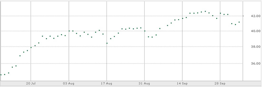
4. Dot chart.